A mental wellbeing product with a cloud AI companion, guided reflection, and access to counseling.
A familiar friend through changing feelings.
VoiceOut is a pre-launch mental wellbeing product for Chinese-speaking people abroad. Its cloud AI companion helps users name emotions, express what is on their mind, and take a small next step.
As UX Design Lead, I led a small team across the companion experience, interaction design, and design system.
03 / Character exploration
Why a cloud? Light, familiar, and expressive.
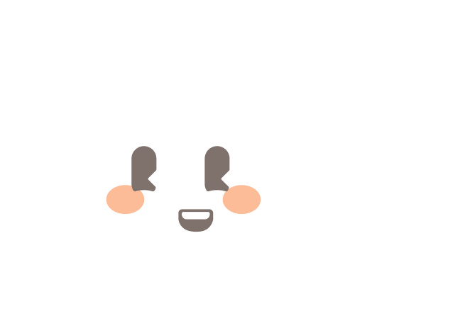
I explored different character directions with the team before choosing the cloud. Its soft silhouette and everyday familiarity supported the kind of relationship we wanted: a companion rather than an authority. The same simple form could feel cheerful, attentive, or reassuring as the conversation changed.
04 / Emotional journey
Meet the feeling before moving through it.
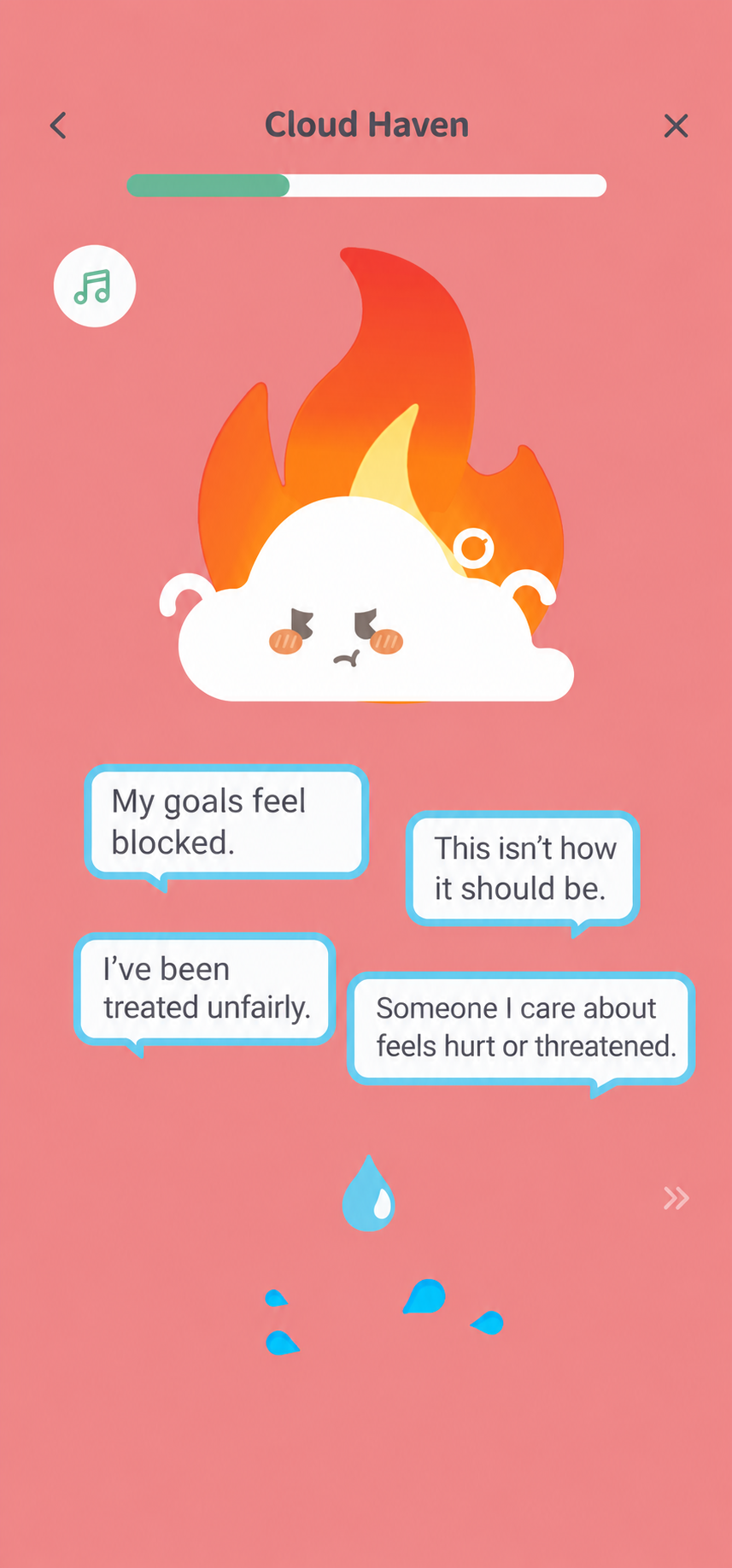
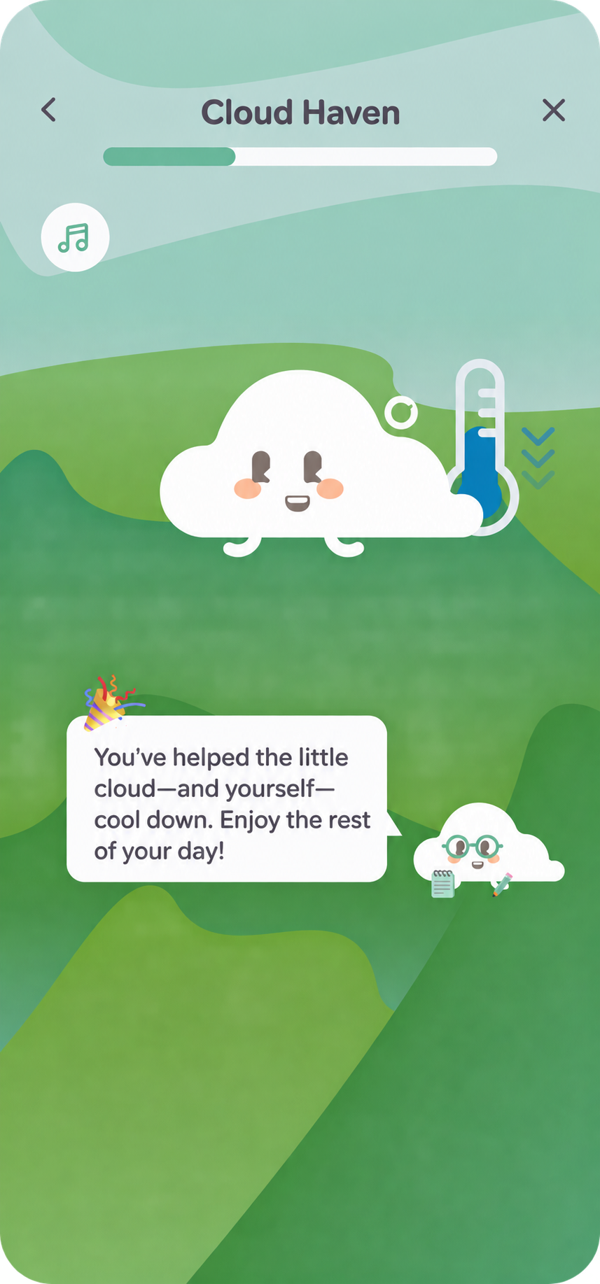
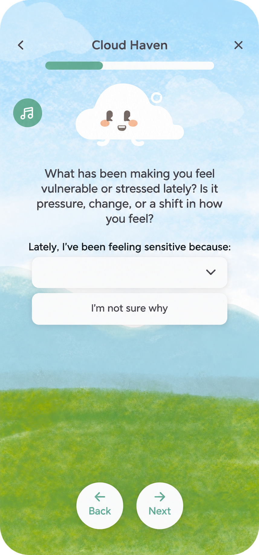
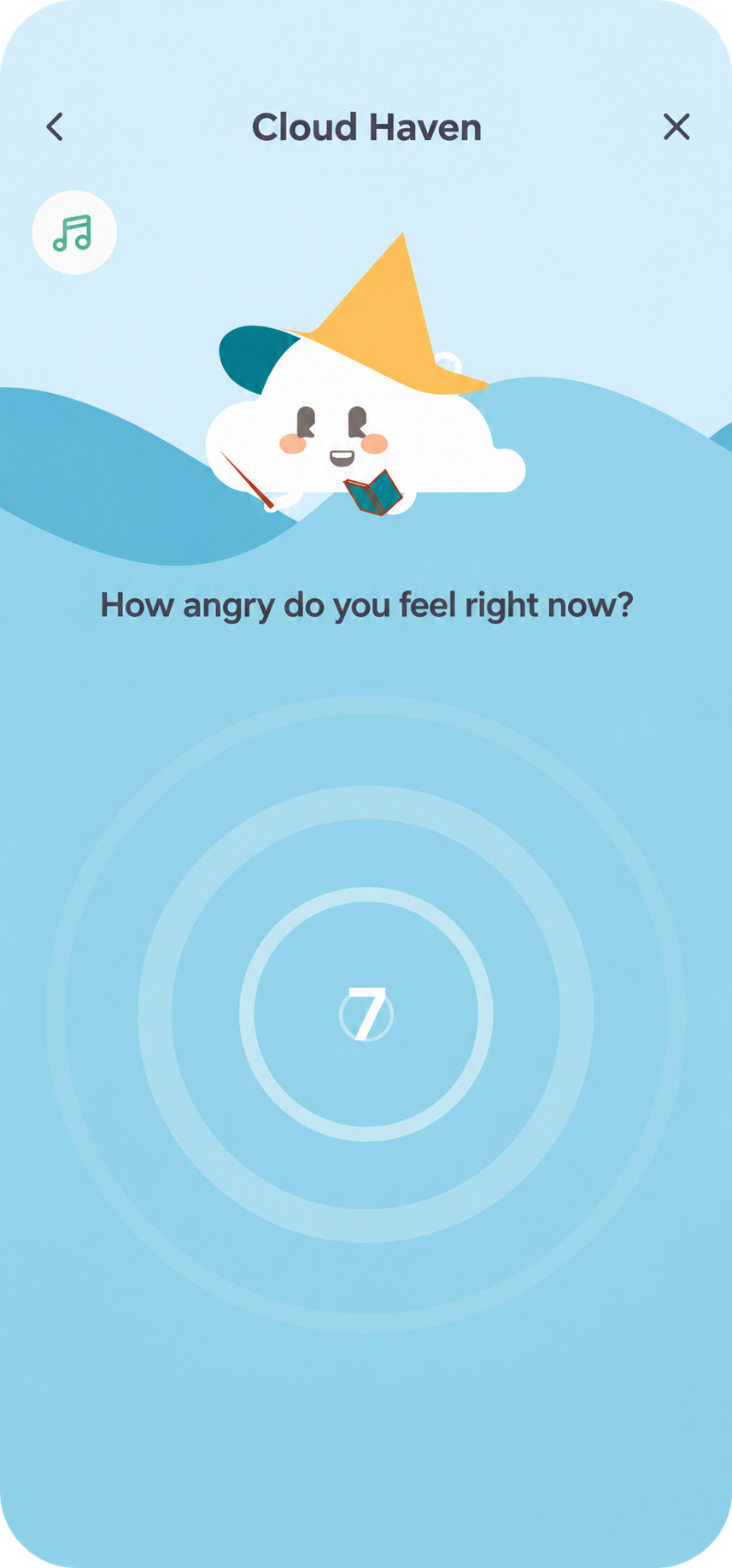
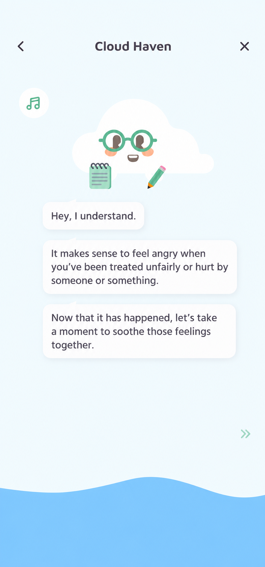
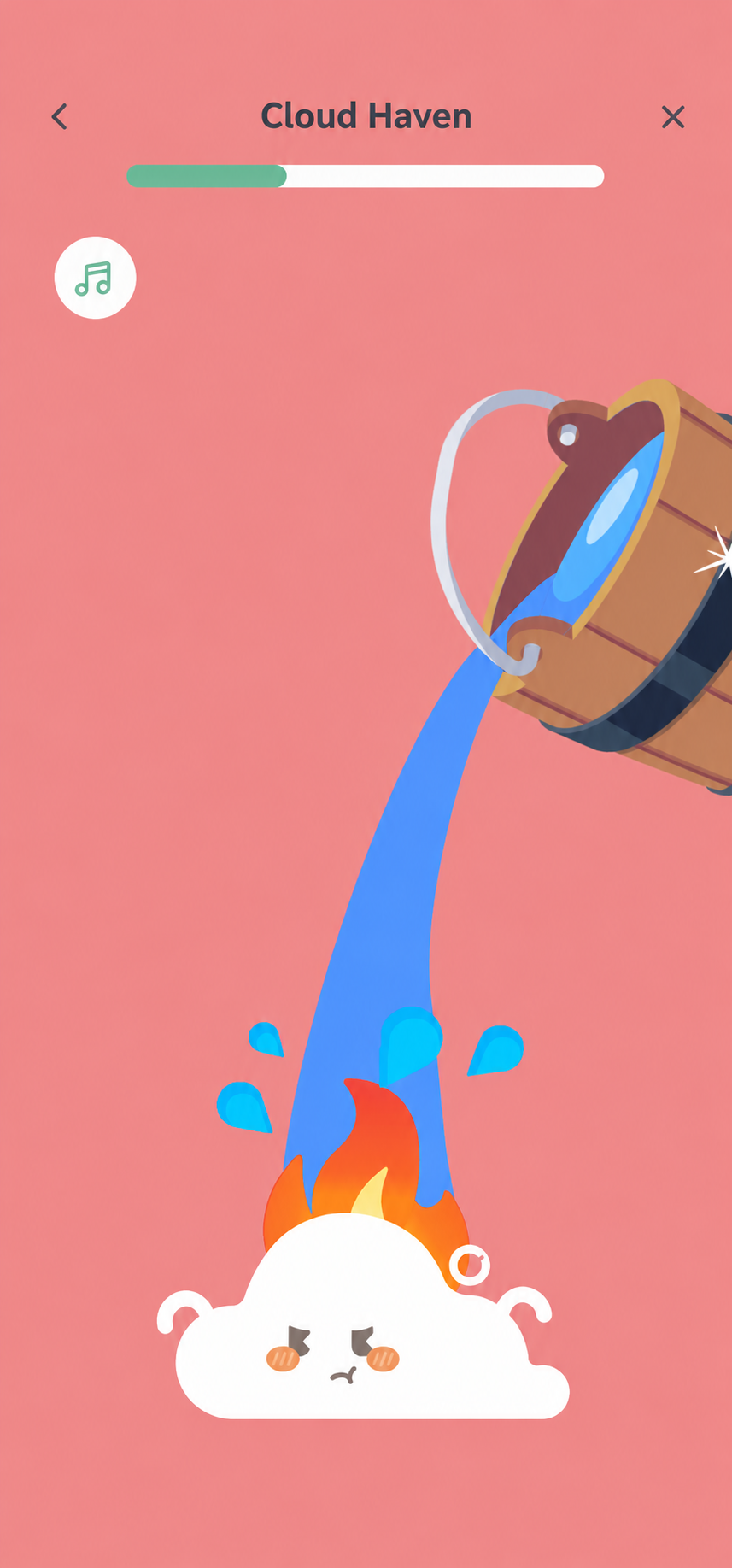
The emotional journey uses different scenes to acknowledge different states. Warm red appears in anger exercises; sky blue opens up a quieter pause; green landscapes mark a more settled moment. The cloud keeps a familiar face through those changes, so the experience feels like one ongoing conversation.
05 / Gentle guidance
A prompt feels different when a friend asks it.
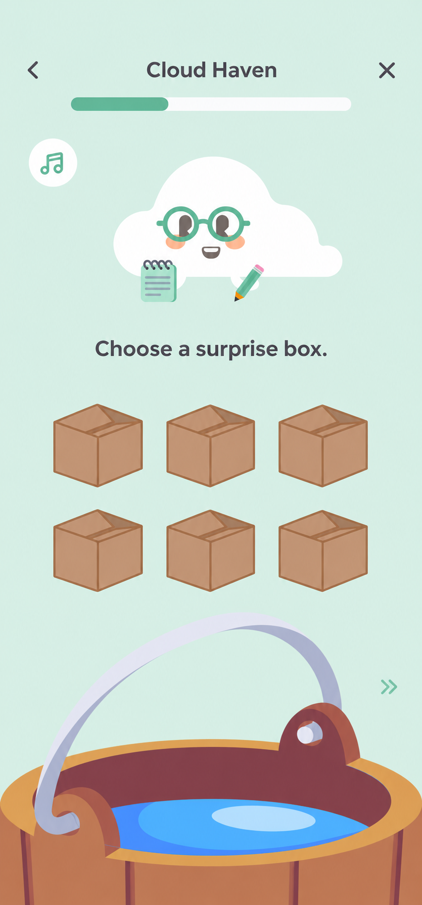
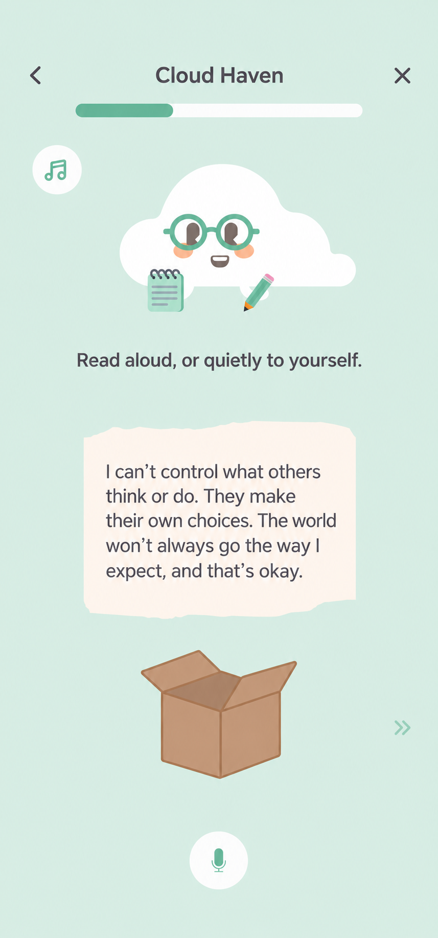
In the guided reflection flow, the cloud puts on glasses and carries a notepad. Users choose a box, then read a reflection aloud or quietly to themselves. That small role change helps frame the companion as a guide, while short prompts keep each step manageable.
06 / Everyday reflection
A familiar face. A changing atmosphere.
Across the journey, the cloud remains recognizable while its surroundings change. Open landscapes, blue water, and green hills give each moment a different tone. The aim was a gentle rhythm: acknowledge a feeling, give it space, and close with encouragement.
07 / Leadership
Keep the story—and the team—connected.
As UX Design Lead, I mentored four design interns, led weekly reviews, maintained the shared design system, and presented prototypes to stakeholders. My role connected the companion’s personality with usable flows and consistent components. This case study covers pre-launch design work; the rationale describes our design intent, rather than measured wellbeing outcomes.